


At Seatti, we often hear the same feedback from both new and longtime customers: "Your product is so easy to use." And that’s no accident.
We’ve built Seatti with one core goal in mind: to make desk booking and hybrid work planning feel effortless. That means user experience (UX) is not just a consideration – it’s a foundational principle. We don’t build features just to check boxes. We build them to help users accomplish their goals quickly, whether that’s booking a desk, finding a meeting room, or organizing their hybrid workweek.
So, how do we ensure a seamless experience every step of the way? It starts with intuitive design.
Let’s walk through the core UX design principles that guide every decision at Seatti.
🎯 1. Clarity & Simplicity in User Interfaces
As Dieter Rams famously said, “Good design is as little design as possible.” That quote, paired with Hick’s Law — which shows decision-making slows down with too many options — reminds us that clarity must always win over complexity.
At Seatti, we follow a minimalist product philosophy. Every element must earn its place on the screen. That’s how features like our 1-click booking suggestions and 3-click resource booking flow came to life — they’re designed to minimize friction and maximize ease of use.

🧭 2. Progressive Disclosure for Advanced Booking Features
Rooted in Jakob Nielsen’s usability heuristics, progressive disclosure allows us to keep Seatti’s interface clean without sacrificing functionality.
Advanced capabilities — such as booking on behalf of others, team bookings, or Team Charters — stay out of the way until the user needs them. Planning a hybrid workweek? Users only see relevant info like calendars, office announcements, or which colleagues will be present — just when it matters.
🧩 3. Consistency Builds Trust
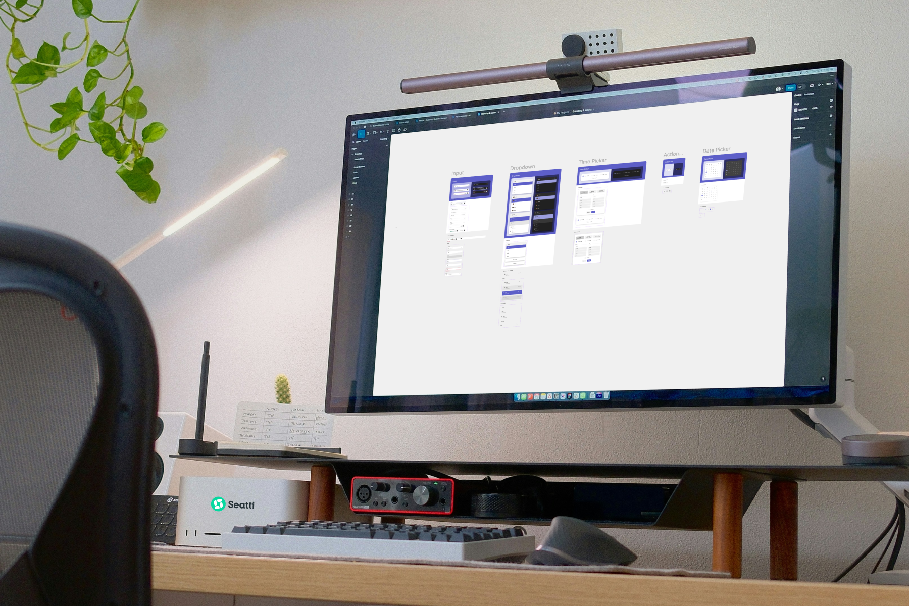
Design consistency increases learnability and boosts user confidence. That’s why we rely on a token-based Figma design system and an atomic design approach to keep everything. From icons to buttons, everything is aligned across the platform.
Following Nielsen’s usability heuristics, wewant to ensure that everything from colors to components follows a unified logic. The result? A product that feels natural from day one.
🌿 4. Whitespace Creates Breathing Room
Inspired by the Swiss Design School, we make intentional use of whitespace to avoid visual overload. Clean spacing enhances focus and scannability, especially in busy tools like hybrid scheduling or resource booking apps.
Our goal: let Seatti breathe. Because a calm, clear interface beats a cluttered one every time.
🎨 5. Intentional Color Use for Clarity
At Seatti, color is never decorative – it’s functional. Drawing from Josef Albers’ color theory, we use a defined palette where each color has a purpose: denoting actions, statuses, or data highlights.
Our color tokens ensure consistent application across all components. Whether you’re an end user or an admin, color always guides, never distracts.

🖋️ 6. Typography That Guides the Eye
We follow Robert Bringhurst’s typography principles to create a clear visual hierarchy between titles, instructions, and body content. With Seatti, typography isn’t about decoration, it’s about direction. Every line of text helps the user scan, understand, and act.
🔄 7. Feedback & System Visibility
Users should never wonder if something worked. That’s why we offer instant confirmations, visual updates, and even email notifications for key actions like bookings or changes.
This is straight from Nielsen’s system status heuristics: always let the user know what’s happening.

🔐 8. User Control & Flexibility
Hybrid work is dynamic, so people will eventually make mistakes. That’s why Seatti gives users full control over their actions. They can modify or cancel bookings, upload floor plans, and even reconfigure resources without hassle.
Whether you're a team member or an office admin, Seatti adapts to your workflow.
💡 Want to experience Seatti’s intuitive design for yourself?
Book a demo and see how seamless hybrid work can really be.
_____________________________________________
📚 UX and Design Inspirations
- Dieter Rams – Ten Principles for Good Design
- William Edmund Hick – Hick’s Law
- Jakob Nielsen – Usability Heuristics for User Interface Design
- Swiss Design School – Modernist Design Principles
- Josef Albers – Interaction of Color
- Robert Bringhurst – The Elements of Typographic Style


